It’s said a heart makes a home. For Josh and Stephanie Wilhite, they took their time to bring personal touches to a remodel of a West Hills family home when it changed hands for the first time in decades.
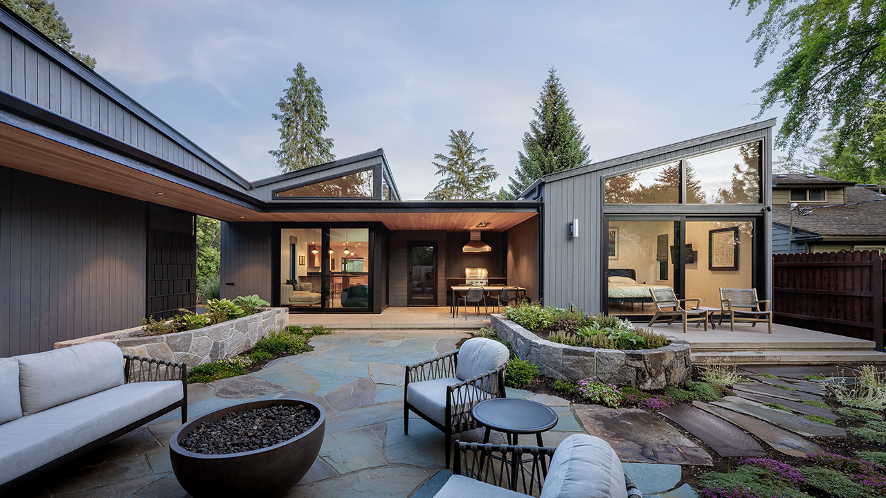
Built in 1979, the mid-century rambler on Trenton Street in Bend began as the home of Linda Mork where she raised her son David on the sprawling triple lot replete with stands of cottonwoods, maples and a centennial ponderosas. Having lived around the corner in a Craftsman-style home since 2007, the Wilhites appreciated the neighborhood with its mix of original homeowners and younger families. Every third or fourth house had an original owner, such as the 95-year-old man who lived down the street. “It’s been a fairy tale,” said Stephanie, to live with close proximity to downtown Bend, Josh’s office on Drake Road and the kids’ elementary school down the street. Ready for a change, the timing was excellent when Linda was ready to sell. “You have the energy and know how to take care of it,” Stephanie recalled Linda telling her.
That may be because Josh is no stranger to building custom homes. As current principal of Copperline Homes, Josh has been in the construction industry since he and Stephanie (a speech pathologist) moved to Bend. His recently-retired father, Mark Wilhite, was the founder of Copperline. However, for Josh to build a home for his family that includes sons Fischer, 11, and Reid, 8, the criteria and goals were different. They sought to create a home unique to their family’s artistic style. Analogous to the family’s love for music, he and Stephanie wanted to wait for the right harmony of elements to come together when they were looking for a house to make their home, then the property on Trenton struck a chord. “I knew immediately,” Stephanie said. The home had both beautiful bones and a history of family, so they knew they could make it their own. “The energy was so good, the light was so good no matter what the time of day; it just felt right to me,” Stephanie said.
The Wilhites bought the home in 2019 and undertook six months of remodeling with an overarching goal to make the home warm, colorful and eclectic to represent the multi-faceted aspects of the family’s personality. They began by reviewing the layout of the house to make changes that updated infrastructure and adapted to contemporary living. Many of the changes were necessary: a new roof, HVAC and floors. The remodeled home creates a visual and livable flow for the active family, as well as for the entertaining they enjoy—their annual Super Bowl party absorbs upwards of sixty people who may mingle through the rambling ranch layout.
Natural wood welcomes
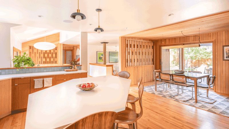
Walking in through the bright front door, visitors are greeted by warm, layered textile art on the wall and a wooden aperture crafted by Ryan DeKay of White’s Fine Woodworking that yawns to give both a screened glimpse of the living areas plus sets the tone for the home’s organic style. The entryway introduces texture, warmth and natural tones with the use of sawn cedar paneling on the walls. Through the wooden portal is a view of the welcoming open-living space. “What sold me on the house was the sunken living room,” Stephanie said. “I walked in, and right away could imagine our family gathering in the space.” It was the first room the Wilhites tackled by removing its yellow carpet and a behemoth wood stove.
Retro-Scandinavian style
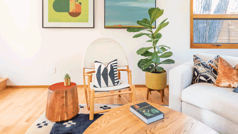
The house and many of its original features helped inform the updated ’70s vibe, and for the Wilhites, there was no need to rush to a finish line. Instead, they worked slowly. “We are very intentional about the things that go in our house. I’d rather it be empty than fill it with stuff that doesn’t matter to me.” Stephanie said. To guide the experience, interior designer Traci French helped hone and curate pieces that were gathered over time for a look that she describes as “mid-century Scandinavian.” Exemplifying the collaborative design experience was the inspiration from a vintage table called “Les Yeux,” by a European designer and with a collector’s price tag. Combining Josh’s design capabilities with the woodworking craftsmanship of DeKay, a unique version of the table inspired by the eye-shaped pattern now anchors the sunken living room as a true focal point.
Within the same gathering space, Josh and Stephanie independently selected his and hers art to pair above a circa 1970 sling-back chair. Similar to other elements in the home, the art is highly personal. Josh’s abstract selection from Madrid artist Jesús Perea is linear and represents the way he sees the world, Stephanie said. Stephanie selected a landscape painting by Nelly Van Nieuwenhuijzen depicting a horizon that for Stephanie evokes places and a vantage point she loves. “We go to the Steens and can see 10 miles all around,” she said. While the artwork is different, the pieces work together in a marriage and complement of color and contrast.
Flowing floorplan
Stepping up from the living room, the dining room space is anchored by a teak sideboard from Stephanie’s grandfather where atop it sits the family’s beloved record player—a way to listen to music beyond the Sonos sound system that permeates the entire home. “Music was always important to us,” Stephanie said. She and Josh met in high school and went to college together in Northern California. “Music is how we fell in love and got married,” she said. They use the turntable to punctuate times of day with genres of music ranging from the country music and classic rock they grew up with, to Grateful Dead or singer-songwriter vibes as they sit around the teak dining table purchased ten years ago in Santa Barbara.
Adjacent to the dining space, the kitchen opened up after Josh removed banks of upper cabinets to create a centerpiece of the island with its unique shape that facilitates movement around its sides. Durable quartz countertops were added along with finishes that the Wilhites selected with the assistance of Lucy Roland of Harper House Design. The kitchen flows to what Stephanie describes as the coziest room in the house: a sunny reading nook. Illuminated by natural light from an open courtyard and a Naguchi light fixture, it’s a go-to place for respite all four seasons of the year.
Sunny style continues in a powder room that harnesses natural light from a skylight to give the space a “bright and happy feel.” Traci French brought in bright flowered wallpaper by Swedish company Svendskt Tenn and leather accents to provide a Scandinavian design nod to natural elements.
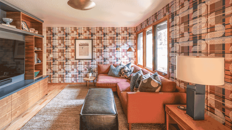
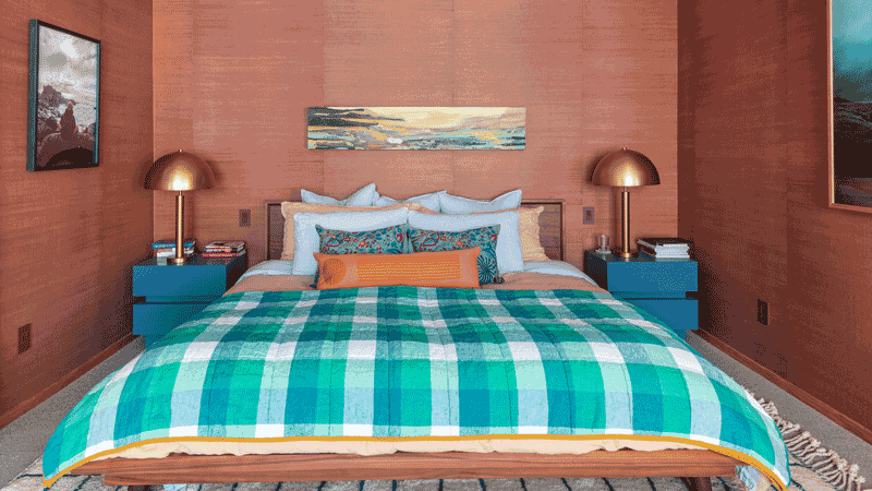
The original floorplan had no primary bedroom, so that project became a priority for the Wilhites. As an homage to the original wallcoverings found throughout the house, contemporary grasscloth was brought in as a base for personal art. Here, an image of the I-5 Grapevine at dusk provides not only tones of purples and blues, but serves as a reminder of family trips to Yosemite over the years. “Each element of our home has to speak to us,” Stephanie says. In another example of patience, the media room project took time. After an extensive search, a wallpaper from contemporary Transylvanian company Mind the Gap finally hit the right notes with its colors, geometric shapes and “Don Draper-y” feel, said Stephanie.
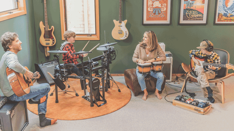
Finally, the creation of a music room provided a space where each Thursday, the family takes music lessons. “Steph and I are putting together a family band,” Josh said. “We just need to get the boys on board!”
Heart as home
There was no rush to complete the home. “Over the years we have been able to figure out what the house needs to be and what it wants to be,” Stephanie said. Upon completion of the remodel, the previous owner visited and was, “over the moon that there’s a young family that has breathed new life into the house and preserved some of her touches,” according to Stephanie. In fact, the first picture the Wilhites put up in the house was one gifted to them by the original owner. The figure, drawn in 1978, watches over the family to bridge past and present through art. “The previous owner dreamed of selling the home to a family that had the same ideals and I think she succeeded,” said Josh. “This is the home that our two boys will grow up in.” Stephanie added, “Once you infuse a house with heart, it becomes a home; this house already had a heart, we just brought it to our family.”
Resources:
Remodel: Copperline Homes
Interior Design: Traci French
Finishes Consultant: Lucy Roland, Harper House Design

