Collage art by Laura Weiler
In 1910, engineer and surveyor Robert B. Gould came to Central Oregon to plot out the townsite of La Pine. He loved the area so much he never left. Gould was a key figure in plotting out the early footprint of many of the Central Oregon townships and in 1916 was credited with creating the first map of Bend.
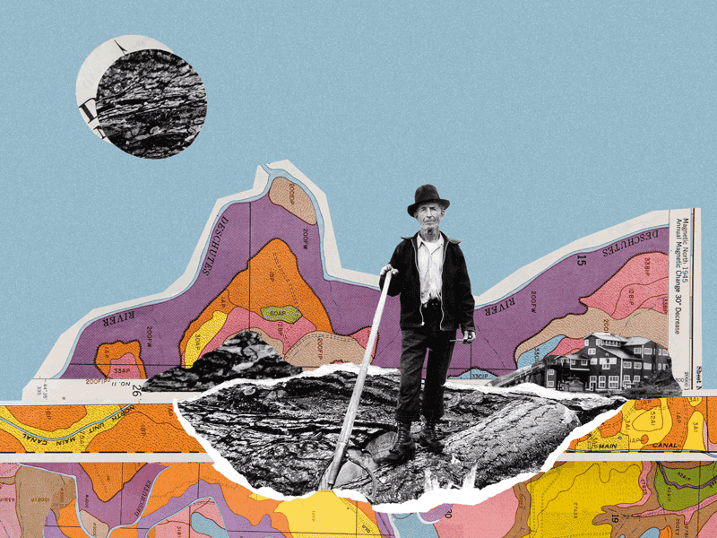
Though the maps of the area have changed considerably since Gould plotted them more than a century ago, much of their purpose remains the same. We use maps to navigate roads and highways, locate a store or restaurant and even find our way around the Old Mill shopping district. Maps also play an important role in the booming tourism industry in the area, from navigating single-track trails at Phil’s to ski runs at Bachelor. The creation of maps, called cartography, has a long history of helping us get from point A to point B and today helps us map the future using geographic information systems.
Start with a paper map
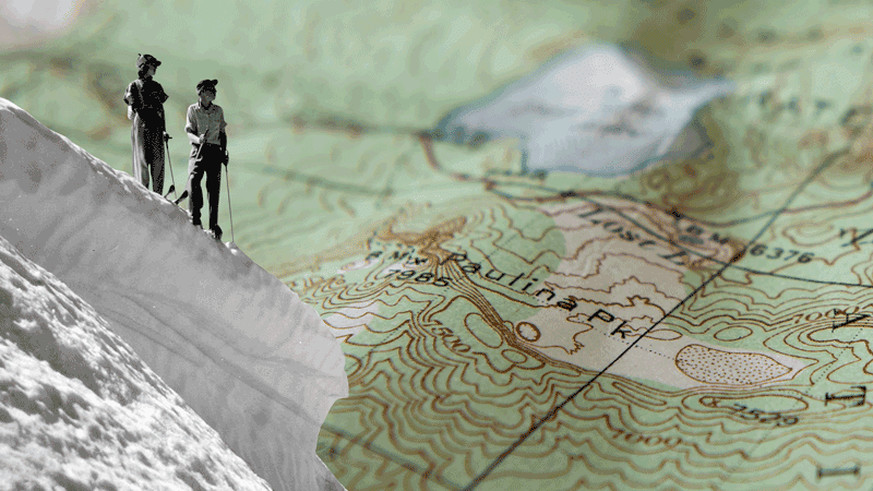
For centuries, paper maps have played a pivotal role in navigation, exploration and understanding the world. Though technology has now changed the breadth and way we interact with some maps, the role of paper maps is still vital. “Bend is a perfect example of why paper maps will continue to play an important role in people’s lives,” said Taylor Monroe, a cartographer at Benchmark Maps in Medford and a 2022 graduate of the Central Oregon Community College (COCC) GIS program. “Tourism and recreation are such a huge focus in the area and maps play a big part of that for so many people.”
Joe Milbrath, a Sisters resident and cartographer for the National Park Service for the past seven years, agrees. Paper maps are just more user-friendly. “The world is trending toward digital maps and interactive maps but the traditional maps are a tool you can’t replace,” he said. “They’re easier to plan with—you can mark them up and personalize your trip,” he said. According to Milbrath, “Each has its own uses, and they can work hand-in-hand, whether navigating or wayfinding or otherwise. Nothing sets yourself up in a landscape better than a paper map.”
Milbrath should know. As one of only four cartographers on staff, he has designed hundreds of maps for parks, monuments, battlefields and historical sites around the country. Though his maps are integrated into various formats from trailside kiosks to roadside signs, the bulk of his time is spent on the maps included in the physical brochures given upon entry at most parks. Milbrath said he loves this aspect of his job and sees it as a rewarding path. “It’s hard to beat creating a map that’s read by millions of people,” he said. More than that, though, Milbrath said he feels his role is important to convey the accurate history of the park. “We’re creating maps for some of the most beautiful places, but also some [with the most troubling history],” he said. “You have to ensure [information] is conveyed in the right way and honors the right people.”
Mapping change
Jared Hanley, co-founder and CEO of mission-driven tech company NatureQuant, said the speed at which technology can process data has changed the way maps can operate. “Maps are one of our best tools at conveying massive amounts of data in a simple, digestible format,” he said. “And because technology is exponential, what would have been impossible to synthesize five-to-ten years ago, is now possible.”
It’s this access and ability to crunch large amounts of data that helps fuel NatureQuant’s signature program, NatureScore, with the simple but poignant goal: to drive home the positive impacts of nature on human health. “When we’re creating our NatureScore we’re taking billions of data points—health tags, geo-tagged objects, satellite imagery—putting them together, and then creating a heat map out of these data points in a single image to tell a story,” said Hanley.
NatureQuant feeds into its algorithm natural elements such as green spaces and water, combines it with human-created elements such as traffic, noise, light and air pollution, and ultimately creates a score to provide an idea of how much access a location has to nature. By working with city planners, municipalities and nonprofits, NatureQuant hopes to use its data and heat maps to drive change. “We want to improve public health by providing access to nature,” said Hanley. “And we create heat maps to do that.”
Blair Deaver, a GIS software solutions architect for international geospatial solutions company Locana, and part-time instructor at Central Oregon Community College, said that technology has also helped to make cartography more accessible and user-friendly to the public. “The big challenge was you used to have to download all the data,” he said. “Today with open data, cloud-based data, it’s much easier.” Deaver added that this accessibility, along with more user-friendly software, is helping to create more maps. “GIS software is much more approachable than it used to be. This allows people who want to dabble with data the ability to make maps,” he said. “Now, especially designers can style maps to create customer experiences and tell deeper stories.”
With the overload of data, however, framing a map in the right context is key, according to Deaver.
“Maps are a natural way for people to see patterns and showcase location intelligence,” he said. Maps tend to tell a story in a much quicker and efficient way than other mediums. To this point, Deaver gave the example of the pandemic’s beginnings. “When COVID-19 first broke, everyone was looking at maps to follow the spread of the disease. This would have been much more difficult in a spreadsheet.”
Deaver said he believes that GIS and the data analysis that comes along with it will help us solve some of the biggest challenges we face today. “Locally, Central Oregon has seen tremendous growth over the past thirty years,” he said. “Looking at issues like land use, water quality, wildfires—being able to analyze data on these topics will allow us to tell a relatable story to the masses and enact change.”
Recent COCC GIS graduate Taylor Monroe believes she and other young cartographers can play a big role in this process. “The younger generation can help champion these key societal issues,” she said. “With the speed of technology and digital, we can reach more people.”
Whether using the latest app, or a trusty paper topographical map, the role of maps will continue to serve as an important tool for navigating the future. Bend’s original cartographer Robert B. Gould would be proud.
Art of the Ski Map
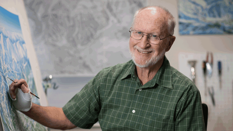
If you’re a skier or snowboarder, chances are you’ve utilized maps created by artist and illustrator Jim Niehues. His hand-painted, beautifully illustrated maps have served as a trail guide for more than 150 ski resorts around North America, including Mt. Bachelor. He is the subject of 292-page hardcover coffee table book, “The Man Behind the Maps,” that compiles maps he has created during his 30-year career.
Bend Magazine sat down with Niehues to talk maps, art and Mt. Bachelor.
BM: You’ve quietly become an icon in the ski world and have been inducted into the Ski Hall of Fame. How does this make you feel?
JN: It’s been thirty-five years of ski maps! I really had no thoughts of such recognition until [I was] nominated. It’s really an honor and very gratifying to know that you may have made a difference in [the] ski industry.
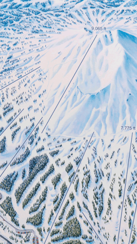
JN: Detail is important in several ways: first, it’s a map that guides you around the mountain. I want skiers to be able to know where they are by recognizing their surroundings on the slope and relating it to the map they hold in their hands. This means showing deciduous or conifer trees where they are, or showing rock features and slope inclines in detail. And second, I want to add credibility that this map is correct and they can rely on it.
BM: Mt. Bachelor offers 360-degree skiing—what was the process like to map that?
JN: Mt Bachelor was a challenge. The “satellite” perspective was necessary over the traditional view that includes a horizon. The secret is simply not to show the horizon, and turn all side slope runs as vertical as possible so the viewer knows they are looking down on the mountain and not horizontally to it. I also used color in some instances with warm colors toward the summit and cool colors in the valleys; warm colors are perceived as near and cool colors further away.
BM: Your artwork is unique in the sense that many carry it with them on their person, referencing it before, during and after their visit on the mountain. What does this mean to you?
JN: I think the fact that skiers review the map over a beer at the end of the day is the most gratifying accomplishment an artist could ask for. They are reliving exploration, excitement, exhilaration, achievement…and some spills, hopefully not too serious. Ski maps are doing more than getting a skier around the mountain. They are collected to reflect the experience or dreamed over for the next adventure.
See jamesniehues.com
Read more about our vibrant Central Oregon community here.
